What is wrong with Netflix, part II
Netflix app discovery experience — a UX/UI case study
The first thing I expect from the Netflix application is consistency with the web version. The brand is what it is, and there is no need to change anything. In addition, users value being able to personalize their experience, whether it’s by creating custom watchlists or receiving tailored recommendations. Finally, it’s worth noting that while the Netflix brand is well-established and loved by many, there is always room for improvement and innovation.

To begin with, the application greets us with a pleasantly branded animation and then takes us to a reasonably well-organized main screen at first glance. However, there are several questions about the presentation of the home screen and the application as a whole when it comes to consistency, as mentioned earlier. Let’s go through them point by point.

- A poster was provided instead of a trailer because it is impossible to stretch a horizontally formatted trailer onto a vertical screen. Therefore, the designers made the correct decision in this case.
- What I can’t say about the movie card itself. Instead of the effect that the card is lying on the surface, it would be better to place the poster on the background and put all the communication elements on top.

- To avoid repeating myself, I will emphasize an important point: the application, like the web, fails to provide users with the impression that the designers did not use empathy when developing this product. On the first screen, the layout appears interesting and diverse. However, when scrolling down, we encounter a forest of posters, where one tree is behind another tree, which is behind yet another tree. The forest seems endless, with thousands of posters. But joking aside, this composition only evokes a desire to exit the application and subscribe to Apple TV or Hulu instead.

- Tab: three icons contain three questions for each of them, as well as separate questions for the general presentation. Why are New & Hot and Downloads given such importance?
- Top navigation: why do I need the “For Tani” header? What information does it convey? Thank you, Netflix, but I remember my name all the time. It would be better to remove the header, organize the menu, and streamline the functionality. For example, the profile should be moved lower to save space, balance the bottom, and relieve the top.
- I want to draw special attention here to the categories. Again like on the web, we can’t select multiple categories, which is consistent with the web, but it is not friendly to the user. The text is too gray and unreadable, and the excessive transparency hinders rather than aids concentration on the headings. It’s important to note that the alignment is right, and the ability to share the movie and cast list is centered on another screen. CENTRAL ALIGNMENT! Come on! Surely, there must have been a better formatting option. We all know that there is.
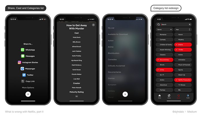
- Movie screen. Good day, transparency. How are you, what are you doing here? I completely understand why you’re here… You’re here because the movie card is designed as a pop-up, rather than a separate page. I don’t understand the reasons behind this choice and the factors that led to this decision but it significantly undermines identity consistency. Also, it’s worth noting the automatic trailer playback, which also undermines consistency and the card’s layout looks cramped. What if I don’t want to watch the trailer automatically? Give me that choice, come on. The icons on the card appear compressed as if there was some kind of restriction on the spacing between the blocks. Perhaps the designer was instructed to not use 20 pixels between blocks to save space. But let’s be real, that’s a joke.
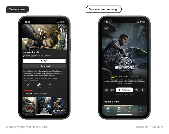
- It is worth discussing the presentation of the list of episodes in the serial card separately. Currently, the information is not presented in a clear sequence, making it difficult to understand what is most important. In my opinion, the name and number of the episode should come first, followed by the picture (the order could also be reversed), then the description, and only then the information about downloading and episode duration. The same problem can see in the episode list that we reached from the play screen.

- One particularly impressive feature is the ability to lock the screen during playback. Additionally, it’s convenient that you can adjust the brightness without leaving the playback or detaching auxiliary windows.


- Furthermore, I noticed that when entering the app, it automatically turns off any music playing on the phone. The purpose of this feature is not very clear, as I have not yet chosen a movie to watch, and I am forced to choose a picture in silence.
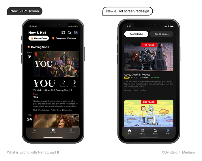
- New & Hot. The presentation of information lacks diversity, with everything piled up and unclear boundaries on the cards, causing everything to merge. It is worth noting that emojis appear here, but they are not repeated anywhere else on other screens.
- Account: it saddens me that I cannot change my data directly in the application. Instead, I am redirected to another page that takes quite some time to load, with a changing background. In short, it would be great to have all the functionality available without any unnecessary movements.

Summary
To avoid repeating information from the previous research on the web version “What is wrong with Netflix, part I,” I would like to elaborate on the mobile application. The mobile application is an important part of the company’s product portfolio, as it provides a convenient way for users to access services on the go. However, it is worth noting that the issues present in the web version are also present in the mobile application. For example, users have difficulty navigating the app and accessing certain features. These issues can lead to frustration and a poor user experience, which could negatively impact our reputation and customer loyalty.
Improving the web should lead to improvements in the application and vice versa, as well as in all other company products. By addressing the issues in the web version, Netflix can identify and resolve similar issues in the mobile application. This will lead to a more seamless user experience across all platforms and ultimately, greater customer satisfaction. Furthermore, by improving its mobile application, Netflix can potentially attract new customers. This could lead to increased revenue and a stronger market position in the industry.


